Components API
Diagram
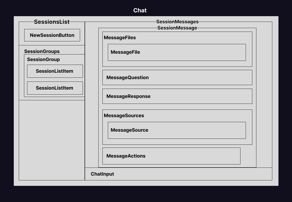
Below is a diagram of the components that make up the package.
Components
Below is the API for the components.
Chat
| Prop | Description | Default |
|---|---|---|
style | The style to apply to the root element.CSSProperties | |
className | The class name to apply to the root element.string | |
viewType | The type of prompt to display.
- Companion: Smaller prompt screen with session lists.
- Console: Full screen experience.
- Chat: Only chat, no sessions.ChatViewType | console |
sessions * | The list of sessions to display.Session[] | |
activeSessionId | The ID of the currently active session.string | |
theme | Custom theme for the chat.ChatTheme | {
base: 'dark:text-white text-gray-500',
console: 'flex w-full gap-4 h-full',
companion: 'w-full h-full overflow-hidden',
empty: 'text-center flex-1',
appbar: 'flex p-5',
status: {
base: 'py-2 px-3 rounded-lg bg-gray-100/50 dark:bg-gray-800/30',
header: 'flex items-center gap-2',
icon: {
base: 'flex-shrink-0 w-4 h-4',
loading: 'text-blue-500 dark:text-blue-400',
complete: 'text-green-500 dark:text-green-400',
error: 'text-red-500 dark:text-red-400'
},
text: {
base: 'text-sm',
loading: 'text-gray-600 dark:text-gray-400',
complete: 'text-gray-600 dark:text-gray-400',
error: 'text-red-600 dark:text-red-400'
},
steps: {
base: 'mt-1 ml-6 space-y-0.5',
step: {
base: 'flex items-center gap-2',
icon: 'flex-shrink-0 w-3.5 h-3.5',
text: 'text-sm',
loading: 'text-gray-500 dark:text-gray-500',
complete: 'text-gray-500 dark:text-gray-500',
error: 'text-red-500 dark:text-red-400'
}
}
},
sessions: {
base: 'overflow-auto',
console:
'min-w-[150px] w-[30%] max-w-[300px] dark:bg-[#11111F] bg-[#F2F3F7] p-5 rounded-3xl',
companion: 'w-full h-full',
group:
'text-xs dart:text-gray-400 text-gray-700 mt-4 hover:bg-transparent mb-1',
create: 'relative mb-4 rounded-[10px] text-white',
session: {
base: [
'group my-1 rounded-[10px] p-2 text-gray-500 border border-transparent hover:bg-gray-300 hover:border-gray-400 [&_svg]:text-gray-500',
'dark:text-typography dark:text-gray-400 dark:hover:bg-gray-800/50 dark:hover:border-gray-700/50 dark:[&_svg]:text-gray-200'
].join(' '),
active: [
'border border-gray-300 hover:border-gray-400 text-gray-700 bg-gray-200 hover:bg-gray-300 ',
'dark:text-gray-500 dark:bg-gray-800/70 dark:border-gray-700/50 dark:text-white dark:border-gray-700/70 dark:hover:bg-gray-800/50',
'[&_button]:opacity-100!'
].join(' '),
delete: '[&>svg]:w-4 [&>svg]:h-4 opacity-0 group-hover:opacity-50!'
}
},
messages: {
base: '',
console: 'flex flex-col mx-5 flex-1 min-h-0',
companion: 'flex w-full h-full',
back: 'self-start p-0 my-2',
inner: 'flex-1 h-full flex flex-col',
title: ['text-base font-bold text-gray-500', 'dark:text-gray-200'].join(
' '
),
date: 'text-xs whitespace-nowrap text-gray-400',
content: [
'mt-2 flex-1 overflow-auto [&_hr]:bg-gray-200',
'dark:[&_hr]:bg-gray-800/60'
].join(' '),
header: 'flex justify-between items-center gap-2',
showMore: 'mb-4',
message: {
base: 'mt-4 mb-4 flex flex-col p-0 rounded-sm border-none bg-transparent',
question: [
'relative font-semibold mb-4 px-4 py-4 pb-2 rounded-3xl rounded-br-none text-typography border bg-gray-200 border-gray-300 text-gray-900',
'dark:bg-gray-900/60 dark:border-gray-700/50 dark:text-gray-100'
].join(' '),
response: [
'relative data-[compact=false]:px-4 text-gray-900',
'dark:text-gray-100'
].join(' '),
overlay:
"overflow-y-hidden max-h-[350px] after:content-[''] after:absolute after:inset-x-0 after:bottom-0 after:h-16 after:bg-linear-to-b after:from-transparent dark:after:to-gray-900 after:to-gray-200",
cursor: 'inline-block w-1 h-4 bg-current',
expand: 'absolute bottom-1 right-1 z-10',
scrollToBottom: {
container: 'absolute bottom-2 left-1/2 transform -translate-x-1/2 z-10',
button: 'rounded-full p-2 shadow-lg'
},
files: {
base: 'mb-2 flex flex-wrap gap-3 ',
file: {
base: [
'flex items-center gap-2 border border-gray-300 px-3 py-2 rounded-lg cursor-pointer',
'dark:border-gray-700'
].join(' '),
name: ['text-sm text-gray-500', 'dark:text-gray-200'].join(' ')
}
},
sources: {
base: 'my-4 flex flex-wrap gap-3',
source: {
base: [
'flex gap-2 border border-gray-200 px-4 py-2 rounded-lg cursor-pointer',
'dark:border-gray-700'
].join(' '),
companion: 'flex-1 px-3 py-1.5',
image: 'max-w-10 max-h-10 rounded-md w-full h-fit self-center',
title: 'text-md block',
url: 'text-sm text-blue-400 underline'
}
},
markdown: {
copy: 'sticky py-1 [&>svg]:w-4 [&>svg]:h-4 opacity-50',
p: 'mb-2',
a: 'text-blue-400 underline',
table: 'table-auto w-full m-2',
th: 'px-4 py-2 text-left font-bold border-b border-gray-500',
td: 'px-4 py-2',
code: 'm-2 rounded-b relative',
toolbar:
'text-xs dark:bg-gray-700/50 flex items-center justify-between px-2 py-1 rounded-t sticky top-0 backdrop-blur-md bg-gray-200 ',
li: 'mb-2 ml-6',
ul: 'mb-4 list-disc',
ol: 'mb-4 list-decimal'
},
footer: {
base: 'mt-3 flex gap-1.5',
copy: [
'p-3 rounded-[10px] [&>svg]:w-4 [&>svg]:h-4 opacity-50 hover:opacity-100! hover:bg-gray-200 hover:text-gray-500',
'dark:hover:bg-gray-800 dark:hover:text-white text-gray-400'
].join(' '),
upvote:
'p-3 rounded-[10px] [&>svg]:w-4 [&>svg]:h-4 opacity-50 hover:opacity-100! hover:bg-gray-700/40 hover:text-white text-gray-400',
downvote:
'p-3 rounded-[10px] [&>svg]:w-4 [&>svg]:h-4 opacity-50 hover:opacity-100! hover:bg-gray-700/40 hover:text-white text-gray-400',
refresh:
'p-3 rounded-[10px] [&>svg]:w-4 [&>svg]:h-4 opacity-50 hover:opacity-100! hover:bg-gray-700/40 hover:text-white text-gray-400'
}
}
},
input: {
base: 'flex mt-4 relative',
upload: ['px-5 py-2 text-gray-400 size-10', 'dark:gray-500'].join(' '),
input: [
'w-full border rounded-3xl px-3 py-2 pr-16 text-gray-500 border-gray-200 hover:bg-blue-100 hover:border-blue-500 after:hidden after:mx-10! bg-white [&>textarea]:w-full [&>textarea]:flex-none',
'dark:border-gray-700/50 dark:text-gray-200 dark:bg-gray-950 dark:hover:bg-blue-950/40'
].join(' '),
actions: {
base: 'absolute flex gap-2 items-center right-5 inset-y-1/2 -translate-y-1/2 z-10',
send: [
'px-3 py-3 hover:bg-primary-hover rounded-full bg-gray-200 hover:bg-gray-300 text-gray-500',
'dark:text-white light:text-gray-500 dark:bg-gray-800 dark:hover:bg-gray-700'
].join(' '),
stop: 'px-2 py-2 bg-red-500 text-white rounded-full hover:bg-red-700 '
},
popup: {
base: [
'bg-white border border-gray-200 rounded-lg shadow-lg overflow-hidden min-w-[200px] max-w-[300px]',
'dark:bg-gray-900 dark:border-gray-700'
].join(' '),
content: 'overflow-y-auto max-h-[250px]',
item: [
'flex items-center gap-2 px-3 py-2 cursor-pointer transition-colors',
'hover:bg-gray-100 dark:hover:bg-gray-800'
].join(' '),
itemHighlighted: 'bg-gray-100 dark:bg-gray-800',
itemIcon: [
'flex-shrink-0 w-5 h-5 text-gray-500 [&>svg]:w-full [&>svg]:h-full',
'dark:text-gray-400'
].join(' '),
itemContent: 'flex flex-col min-w-0 flex-1',
itemLabel: [
'text-sm font-medium text-gray-900 truncate',
'dark:text-gray-100'
].join(' '),
itemDescription: 'text-xs text-gray-500 dark:text-gray-400 truncate',
itemShortcut: 'text-xs text-gray-400 dark:text-gray-500 ml-auto',
empty: 'px-3 py-4 text-sm text-center text-gray-500 dark:text-gray-400',
loading: [
'flex items-center justify-center gap-2 px-3 py-4 text-gray-500',
'dark:text-gray-400'
].join(' ')
},
tag: {
base: [
'inline-flex items-center px-1.5 py-0.5 mx-0.5 rounded',
'font-medium text-sm leading-[1.2] relative top-[1px]'
].join(' '),
mention: [
'bg-blue-100 dark:bg-blue-900/30',
'text-blue-700 dark:text-blue-300'
].join(' '),
command: [
'bg-purple-100 dark:bg-purple-900/30',
'text-purple-700 dark:text-purple-300'
].join(' ')
},
editor: {
base: [
'outline-none w-full overflow-y-auto',
'text-inherit font-inherit',
'[&_.tiptap-paragraph]:m-0'
].join(' '),
container: 'px-3 py-2 pr-16',
placeholder: [
'[&_.is-editor-empty]:before:content-[attr(data-placeholder)]',
'[&_.is-editor-empty]:before:text-gray-400',
'[&_.is-editor-empty]:before:dark:text-gray-500',
'[&_.is-editor-empty]:before:float-left',
'[&_.is-editor-empty]:before:h-0',
'[&_.is-editor-empty]:before:pointer-events-none'
].join(' ')
}
},
suggestions: {
base: 'flex flex-wrap gap-2 mt-4',
item: {
base: [
'rounded-full! max-w-full py-2 px-4',
'bg-gray-100 border-gray-200 hover:bg-gray-200 hover:border-gray-300 text-gray-700',
'dark:bg-gray-800/50 dark:border-gray-700 dark:hover:bg-gray-700/70 dark:hover:border-gray-600 dark:text-gray-200',
'[&>svg]:w-4 [&>svg]:h-4 [&>svg]:text-blue-500 [&>svg]:dark:text-blue-400 [&>svg]:flex-shrink-0'
].join(' '),
icon: 'w-4 h-4 text-blue-500 dark:text-blue-400 flex-shrink-0',
text: 'text-sm truncate'
}
},
chart: {
base: 'my-6',
title: 'text-sm font-medium mb-2 text-gray-600 dark:text-gray-400',
content: 'flex items-center justify-center',
error: {
base: [
'my-4 p-4 border rounded',
'border-red-300 bg-red-50 text-red-500',
'dark:border-red-700 dark:bg-red-900/20'
].join(' '),
title: 'text-red-600 dark:text-red-400 text-sm font-medium mb-2',
code: 'text-xs overflow-auto'
},
warning: {
base: [
'my-4 p-4 border rounded',
'border-yellow-300 bg-yellow-50 text-yellow-600',
'dark:border-yellow-700 dark:bg-yellow-900/20 dark:text-yellow-400'
].join(' '),
title: 'text-yellow-600 dark:text-yellow-400 text-sm font-medium mb-2'
}
}
} |
remarkPlugins | Remark plugins to apply to the request/response.Plugin<[], Node, Node>[] | [remarkGfm, remarkYoutube, remarkMath] |
markdownComponents | Custom markdown components to override default rendering.
Use this to add support for custom elements like charts.Components | |
isLoading | Whether to display a loading state.boolean | |
disabled | Whether to disable the chat.boolean | |
onSelectSession | Callback function to handle when a session is selected.(sessionId: string) => void | |
onDeleteSession | Callback function to handle when a session is deleted.(sessionId: string) => void | |
onNewSession | Callback function to handle creating a new session.() => void | |
onSendMessage | Callback function to handle sending a new message.(message: string) => void | |
onStopMessage | Callback function to handle stopping the current action.() => void | |
onFileUpload | Callback function to handle file upload.(file: File) => void |
ChatInput
| Prop | Description | Default |
|---|---|---|
defaultValue | Default value for the input field.string | |
allowedFiles | Allowed file types for upload.string[] | |
placeholder | Placeholder text for the input field.string | Type a message... |
sendIcon | Icon to show for send.ReactElement<any, string | JSXElementConstructor<any>> | <SendIcon /> |
stopIcon | Icon to show for stop.ReactElement<any, string | JSXElementConstructor<any>> | <StopIcon /> |
attachIcon | Icon to show for attach.ReactElement<any, string | JSXElementConstructor<any>> | |
mentions | Configuration for mentions (@user).
Provide items or an onSearch function to enable mentions.SuggestionConfig<MentionItem> | |
commands | Configuration for commands (/command).
Provide items or an onSearch function to enable commands.SuggestionConfig<SlashCommandItem> | |
minHeight | Minimum height for the input (default: 24px)number | 24 |
maxHeight | Maximum height for the input (default: 200px)number | 200 |
autoFocus | Whether to auto-focus the input on mount (default: true)boolean | true |
RichTextInput
| Prop | Description | Default |
|---|---|---|
value | Current value of the inputstring | |
placeholder | Placeholder text when emptystring | Type a message... |
disabled | Whether the input is disabledboolean | false |
autoFocus | Whether to auto-focus on mount (default: true)boolean | true |
className | Additional CSS classesstring | |
minHeight | Minimum height in pixels (default: 24)number | 24 |
maxHeight | Maximum height in pixels (default: 200)number | 200 |
mentions | Configuration for @ mentionsSuggestionConfig<SuggestionItem> | |
commands | Configuration for / slash commandsSuggestionConfig<SuggestionItem> | |
onSubmit | Callback when user submits (presses Enter)(value: string) => void | |
onChange | Callback when input value changes(value: string) => void |
MentionList
| Prop | Description | Default |
|---|---|---|
items * | List of suggestion items to displaySuggestionItem[] | |
command * | Callback to execute the selected suggestion command(item: { id: string; label: string; }) => void | |
triggerChar * | The trigger character (e.g., '@' or '/')string | |
config * | Configuration for the suggestion popupSuggestionConfig<SuggestionItem> | |
query | Current search query textstring |
SessionList
| Prop | Description | Default |
|---|
SessionListItem
| Prop | Description | Default |
|---|---|---|
session * | Session to display.Session | |
deletable | Indicates whether the session is deletable.boolean | true |
deleteIcon | Icon to show for delete.ReactElement<any, string | JSXElementConstructor<any>> | <TrashIcon /> |
chatIcon | Icon to show for chat.ReactElement<any, string | JSXElementConstructor<any>> | <ChatIcon className="mr-2" /> |
limit | Limit for the ellipsis.number | 100 |
SessionGroups
| Prop | Description | Default |
|---|---|---|
children | Render function for the session groups.(groups: GroupedSessions[]) => ReactNode |
SessionGroup
| Prop | Description | Default |
|---|
NewSessionButton
| Prop | Description | Default |
|---|---|---|
newSessionText | Text for the new session button.ReactNode | New Session |
SessionMessages
| Prop | Description | Default |
|---|---|---|
newSessionContent | Content to display when there are no sessions selected or a new session is started.ReactNode | |
limit | Limit the number of results returned. Clientside pagination.number | 10 |
showMoreText | Text to display for the show more button.string | Show more |
showScrollBottomButton | Whether to display the scroll to bottom button.boolean | false |
children | Render function for the session messages.(conversations: Conversation[]) => ReactNode |
SessionMessage
| Prop | Description | Default |
|---|---|---|
conversation * | Conversation to render.Conversation | |
isLast | Whether the message is the last one in the list.
This let's the chat know when to show the loading cursor.boolean |
SessionMessagePanel
| Prop | Description | Default |
|---|---|---|
allowBack | boolean | true |
SessionMessagesHeader
| Prop | Description | Default |
|---|
SessionEmpty
| Prop | Description | Default |
|---|
MessageSources
| Prop | Description | Default |
|---|---|---|
sources * | Sources to render.ConversationSource[] |
MessageSource
| Prop | Description | Default |
|---|---|---|
limit | Limit for the title.number | 50 |
url | URL of the source, if applicablestring | |
title | Title or description of the sourcestring | |
image | Image URL of the source, if applicable.string |
MessageActions
| Prop | Description | Default |
|---|---|---|
question * | Question to be copiedstring | |
response | Response to be copiedstring | |
copyIcon | Icon to show for copy.ReactElement<any, string | JSXElementConstructor<any>> | |
thumbsUpIcon | Icon to show for thumbs up.ReactElement<any, string | JSXElementConstructor<any>> | |
thumbsDownIcon | Icon to show for thumbs down.ReactElement<any, string | JSXElementConstructor<any>> | |
refreshIcon | Icon to show for refresh.ReactElement<any, string | JSXElementConstructor<any>> | |
onCopy | Callback function to handle copying.() => void | |
onUpvote | Callback function to handle upvoting.() => void | |
onDownvote | Callback function to handle downvoting.() => void | |
onRefresh | Callback function to handle refreshing.() => void |
MessageQuestion
| Prop | Description | Default |
|---|---|---|
question * | Question to render.string | |
files | Array of sources referenced in the conversationConversationFile[] |
MessageResponse
| Prop | Description | Default |
|---|---|---|
response * | Response to render.string | |
isLoading | Whether the response is loading.boolean |
MessageFiles
| Prop | Description | Default |
|---|---|---|
files * | Files to render.ConversationFile[] |
MessageFile
| Prop | Description | Default |
|---|---|---|
fileIcon | Icon to show for delete.ReactElement<any, string | JSXElementConstructor<any>> | <FileIcon /> |
limit | Limit for the name.number | 100 |
name * | Name of the filestring | |
type | Type of the filestring | |
size | Size of the filenumber | |
url | URL of the filestring |
ChatSuggestions
| Prop | Description | Default |
|---|---|---|
suggestions * | Array of suggestions to display.Suggestion[] | |
className | Custom class name to apply to the container.string | |
onSuggestionClick | Callback when a suggestion is clicked.(suggestion: string) => void | |
children | Custom render function for each suggestion item.
Receives the suggestion data and onClick handler.ReactElement<any, string | JSXElementConstructor<any>> |
MessageStatus
| Prop | Description | Default |
|---|---|---|
status | Current status state.MessageStatusState | loading |
text * | Main status text to display.string | |
steps | Optional sub-steps to display.MessageStatusStep[] | |
icon | Custom icon to display. If not provided, uses default icons based on status.ReactNode | |
className | Additional CSS class name.string |
MessageStatusItem
| Prop | Description | Default |
|---|---|---|
step * | The step to display.MessageStatusStep |
ChartRenderer
| Prop | Description | Default |
|---|---|---|
config * | The chart configuration.ChartConfig | |
className | The class name to apply to the chart container.string |